The use of colored tiles in decoration has become an increasingly popular trend among interior designers and design enthusiasts. Their ability to bring vibrancy, personality, and freshness to spaces makes them an ideal choice for both residential and commercial projects. However, the key to success lies not only in choosing an attractive design but also in knowing how to combine them in a balanced way.
Combining colorful tiles with neutral tones
Colorful tiles look especially good when paired with neutral tones such as white, gray, or beige. These colors act as a canvas that enhances the vibrancy of the tile without overwhelming the space. For example, a kitchen backsplash with mosaic tiles in shades of blue and green combines elegantly with light-colored countertops and natural wood furniture.
Colorful flooring as a star feature
If you’re looking for a floor that won’t go unnoticed, colorful flooring can completely transform the perception of a space. Geometric, encaustic, or nature-inspired patterns are perfect for living rooms and entryways, as they create an immediate visual impact. To maintain balance, it’s advisable to pair this flooring with walls in soft tones and furniture with simple lines.
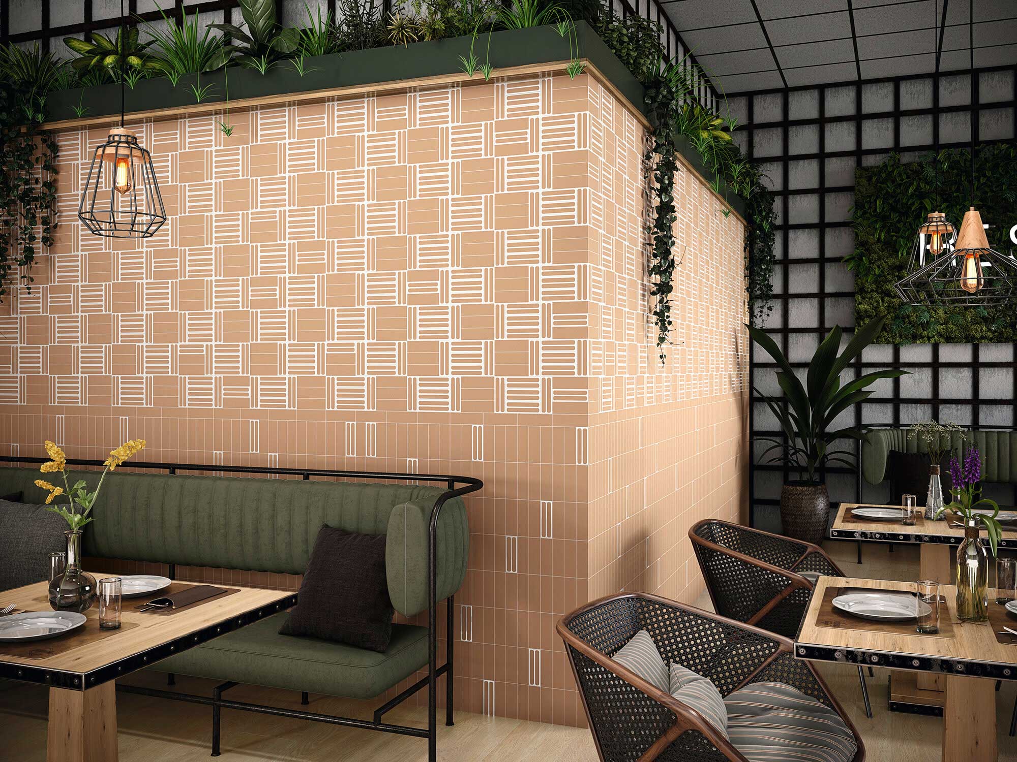
Inspiring combinations with colorful tiles
The possibilities offered by colorful tiles are almost endless, and each combination conveys a distinct atmosphere. Here are some of the most recommended by industry professionals:
- Mediterranean style: Combine tiles in turquoise, white, and sand tones with light wood elements and linen textiles. This style conveys freshness, light, and serenity, ideal for open kitchens or terraces.
- Retro ambiance: Hydraulic tile designs with geometric patterns in red, mustard, and blue create a distinctive vintage feel. Pair them with metal furniture or reclaimed pieces to reinforce that nostalgic and authentic spirit.
- Vibrant minimalism: In spaces where white or gray predominates, introducing a colorful tile on a specific wall creates a focal point that breaks the monotony without losing visual order (for example, bathroom tiles placed in a shower).
- Elegant contrasts: Colorful flooring with dark tones and bright nuances combines perfectly with light walls and metallic accessories, adding sophistication.
- Bohemian style: Mix tiles in different warm tones (terracotta, greens, and deep blues) and combine them with plants and patterned textiles. It’s ideal for those seeking a home full of personality and character.
Tips for successfully combining colorful tiles
Working with color can be challenging if you don’t consider certain key aspects. These practical tips will help you achieve a balanced and lasting result:
- Define a base palette: Before choosing a colorful tile, establish which colors will dominate the space and which will be secondary. This will prevent overwhelming the room.
- Apply the 60-30-10 rule: A classic in interior design. Use 60% neutral tones (walls and large surfaces), 30% complementary colors (furniture, textiles), and reserve 10% for the colorful tile or flooring as the focal point.
- Balance textures and finishes: If the tile has a striking design, balance it with simpler materials such as smooth woods or soft marbles.
- Consider lighting: Natural light enhances vibrant colors, while warm artificial light can intensify red and yellow tones. Before choosing, check how the tile performs under different lighting conditions.
- Prioritize durability: Select quality materials that will withstand the test of time and frequent cleaning, especially in kitchens and bathrooms. Less is more: although a colorful floor can be spectacular, it’s best to let it be the star, avoiding competing with too many decorative elements around it.
In short, both colorful wall coverings and flooring are perfect allies for bringing any room to life. Their correct combination not only enhances the aesthetics of the home, but also reflects the personality and style of its inhabitants.